A new guided path to your automobile service experience
THE TEAM
I am working as a freelance UX designer collaborating with a team of passionate android developers from Freshlancers.
My roles and responsibilities
• Lead research workshop and analysis
• Design the experience of the different stakeholders for specific devices (as mentioned in the project phases) including creating key user flows and wire-flows.
• Deliver high fidelity wireframes & interface designs to show the full product experience.
• Share deliverables for development including a light design system for Dealer Line
THE CHALLENGE
The client, who has been in the business of selling automobile maintenance services for over 30 years, reached out to us (freshlancers team and me) with an idea of this application which was a result of two underlying problems in most of the US cities.
The key constrains of their customers today is not knowing what the best package is, what they include or what it even means.
They do not really have an understanding of the different service plans available and how they can optimise them for their personal needs.
The dealer agents find it difficult to bridge the gap between the knowledge of different services and their benefits and increase their sales.
The automotive dealer employees aren’t tech-savvy and still pursue an old-school style of paper and native desktop applications, making it difficult to scale-up
Dealer Line is an ecosystem designed for automobile dealers to educate and help both, their agents and their customers understand and know the various services and then optimised their maintenance and service packages for their cars.
MY PROCESS
3 weeks from research, analysis to idea
Understand stakeholders & the ecosystem
Empathise with the user’s journey and key job stories
Synthesis the analysis with application architecture
Ideate & Evaluate features with wireframes and prototypes
Mapping the key user flows using wire-flows
Interface design & UI specifications of the solution
Research & Analysis
WORKSHOP
This was an opportunity to bring the working team, including the client, to a mutual understanding of the problem to be solved.And to share the relevant context so the answers to “Who is the customer, who is the user, and what are their problems?”, can be understood clearly, without coming up with solutions yet.
Activities & Goals
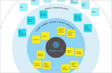
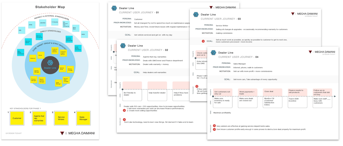
Stakeholder map
This tool was used to determine who the stakeholders are, how involved would they be while using Dealer Line’s eco-system. This was also, an additional moment for us to discover how much attention and focus we should apply for the direct, indirect & external stakeholders.
We choose 4 stakeholder that we would focus on for the different phases of the project.
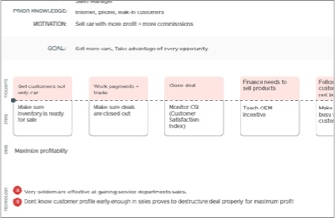
Existing customer Journey
This tool was used for gaining a deeper understanding of the selected stakeholders currently behave, where they run into obstacles (pain-points) and how they currently solve those.
Understanding these points helped us improve the information & solution during the design phase.
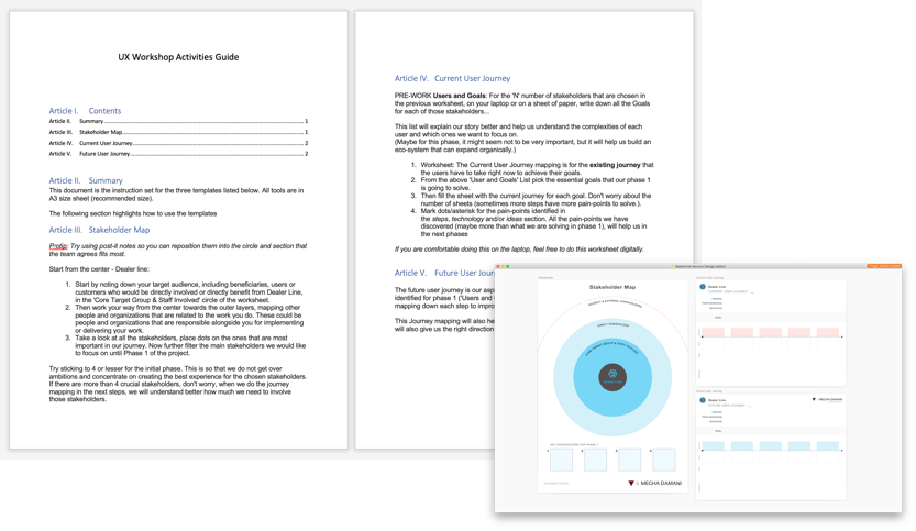
Workshop activities and a guide to understand how to use them
ANALYSIS and Outputs
From the stakeholder map, we picked the 4 most important stakeholders we wanted to target and start work from.
I digitised the worksheets and highlighted the pain-points and opportunities where Dealer Line could improve and benefit from.
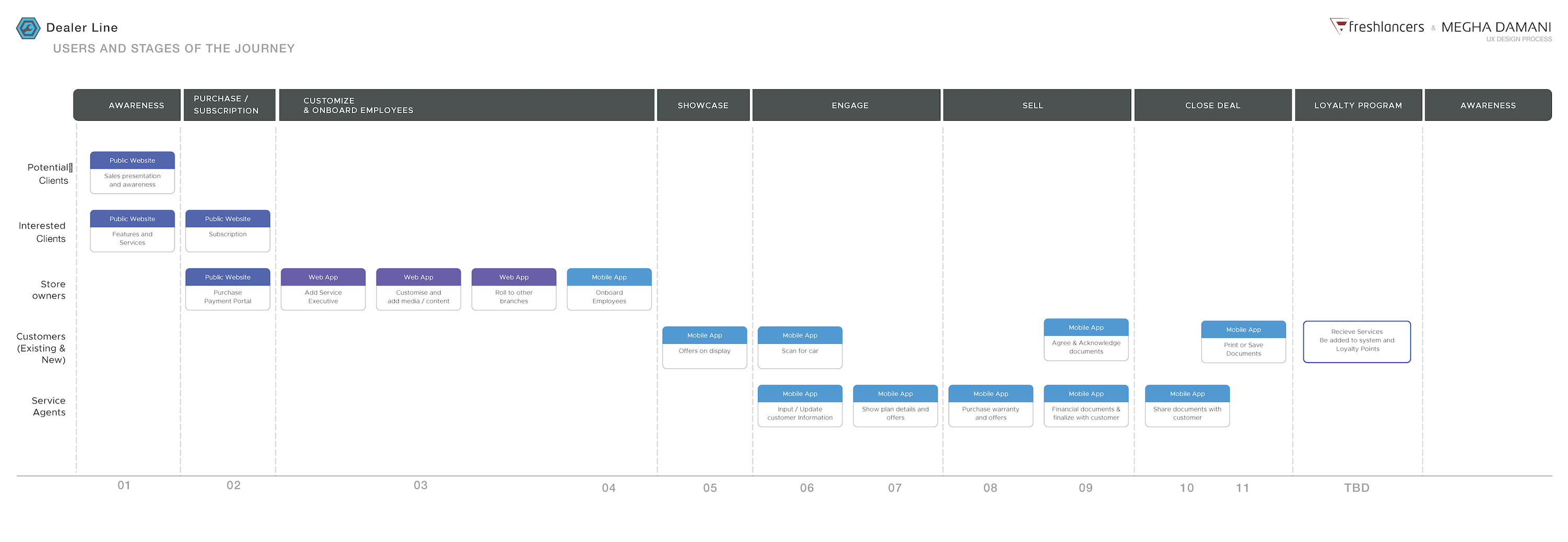
Further I created the a map with the users and different phases they would play a key role and the steps they would take which would influence the decisions taken by other stakeholders.
From here we took a decision to focus on the table app as phase 1.
Results of the stakeholder & user journey activities from the workshop
Image of the different stages and touch-points
The key stakeholders defined during the research
Project Definition
Dealer Line was envisioned to be a cloud platform where car dealerships can build their knowledge centres and customise their services based on their financials, localisation and habits of their customers.
The project was divided into three phases.
Phase 1: Feature detailing & designing the tablet Proof-of-concept.
Phase 2: Development & validation by usability testing.
These two stages would be designed for theService Writers & Customers.
Phase 3:Designing the dashboard & platform to create an end-to-end ecosystem.
Current status: As a team, we’ve completed 2 phases of this project. The 3rd phase is going to start in a few weeks.
Phase 1
Abby, the project owner, and I started this phase by detailing the features for the android tablet application; while the client created quick power-point concept of the app he had in mind derived from what we had learnt from his experience & competitors analysis.
UX SETUP
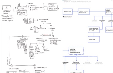
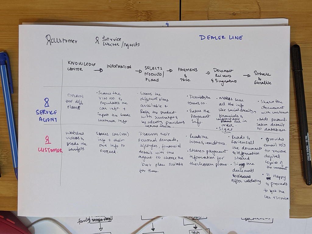
I started my UX process by designing an interaction journey map between a service writer and a customer, in a scenario where the customer is buying maintenance service plans by using the app we envisioned.
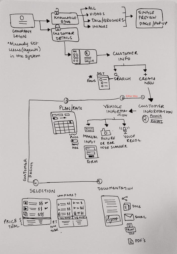
Once we had an almost finalised list of the features, the power-point concept of the app, I detailed the apparchitecture and flow of information.
Interaction Journey Map
App Architecture & Information Flow
Wireframes & Flows
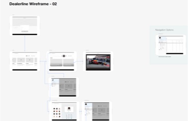
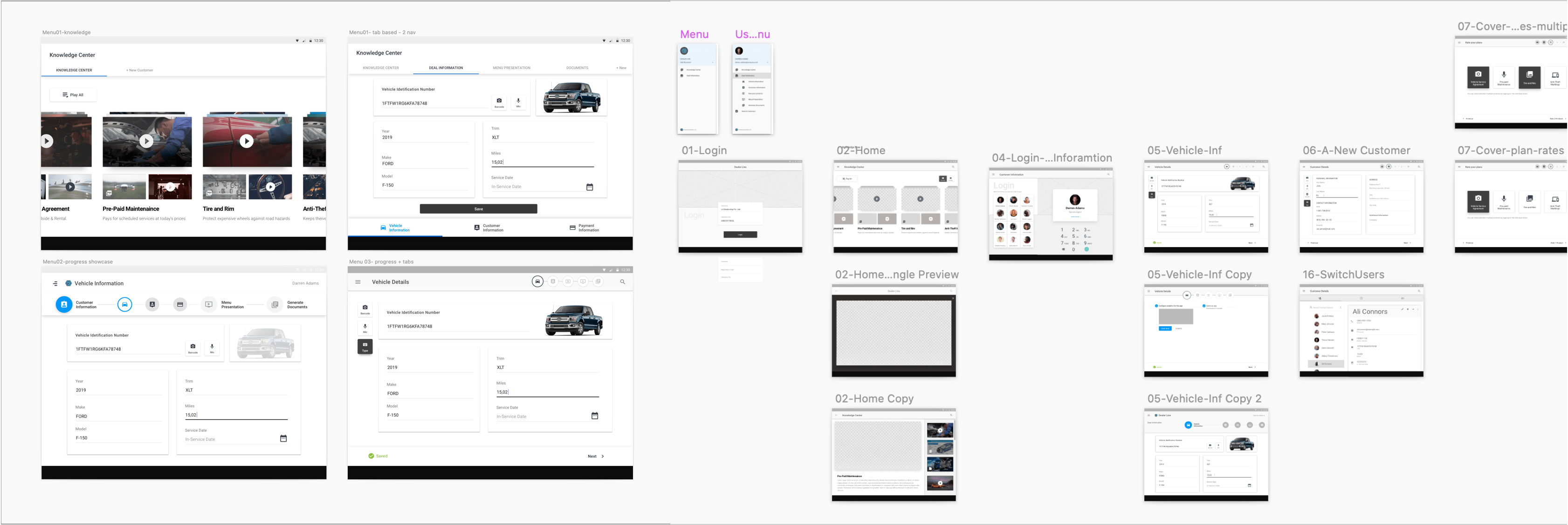
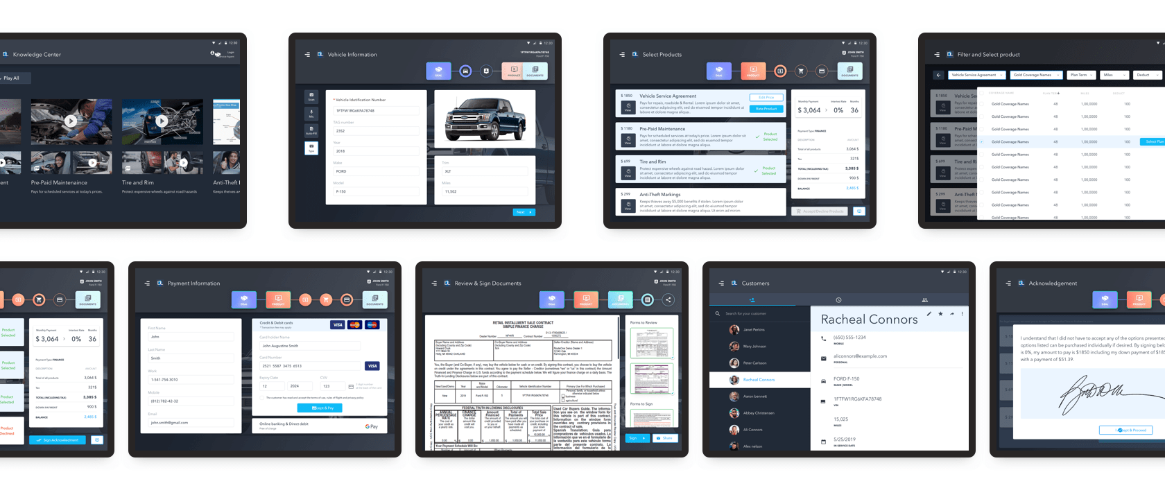
My next step was to start with low fidelity wireframes (paper & pen) and then moved to a high-fidelity designs, sharing the different layouts for the pages that we had define for the Dealer Line application.
I tested different menu and navigational ideas with the rest of the team and the client to gather further insights of what the service writer’s behaviour was and which version was more intuitive and inclusive in terms of usability.
Further, I designed wireframes for the different screens keeping material design, touch-based interactions and accessibility in mind. (Referencing to WCAG 2.1 guidelines as well)
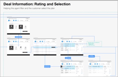
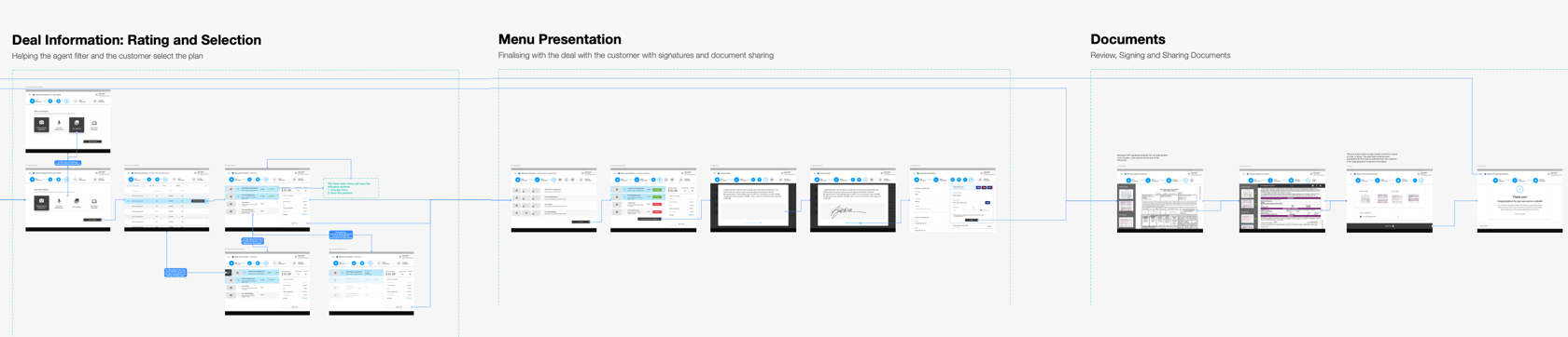
USER Flows
Mapping the journey through the application screens to visualise the complete path that the service writers would follow across the whole application making it easy to validate if the application’s processes are complete.
This was designed such that it would be an instant communication with the development team about the of the app-flow.
Wireframe prototype
These wireframes and design ideas were prototyped using Invision to test the flow, usability and understanding of the app steps with the client though basic point and click interactions. A quick proof-of-concept before moving to the interface design.
1st round of testing
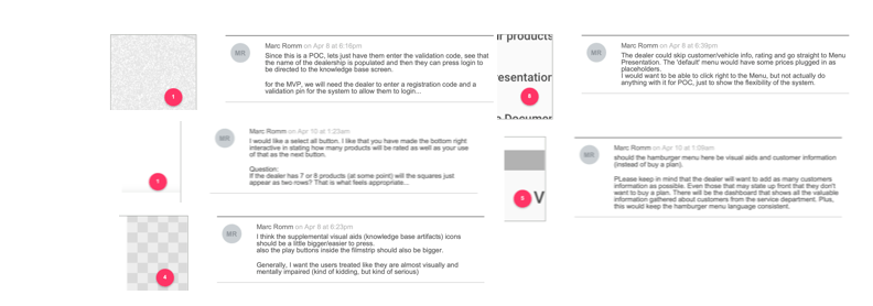
Using the wireframe prototype, we did a preliminary round of testing with the client and one of the dealers they were in touch with.
This testing was supervised by the client. I had defined specific tasks that they had to follow.
The feedback of the information flow, intuitiveness & experience were gathered using comments on the prototype as and when the tasks were being performed.
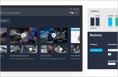
User Interface Design
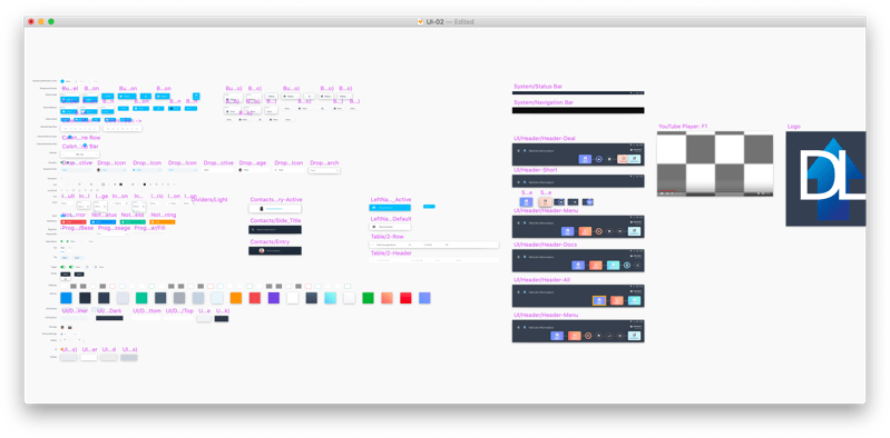
Since this was a new startup, the client does not have brand guidelines or Interface design elements. I started with choosing a color palette inspired from their logo and its evolution. Then proceeded to select a spectrum of colors, necessary for the different sections of the UI, that would compliment the dark blues.
After finding all usability and flow errors through testing, I began designing the final screens in Sketch, using material design system guidelines and components.
Interface exploration
Working with legibility and use of the application on daily basis, we decided to go with the dark mode, which also enhanced the customer’s experience as it highlighted the content withinin the white boxes & avoiding the glare.
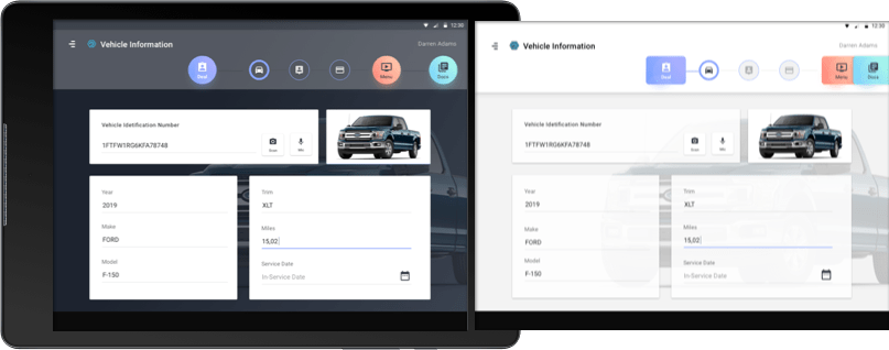
FINAL INTERFACE DESIGN
Phase 2
Development, testing and iteration
Understanding all the roadblocks and experience issues from the first release, there were a specific sections defined by the client & project owner, that needed to be simplified and re-designed.
There were also additional information and features added to the app, after receiving feedback from the dealers and service writers, with whom the designed prototype was shared.
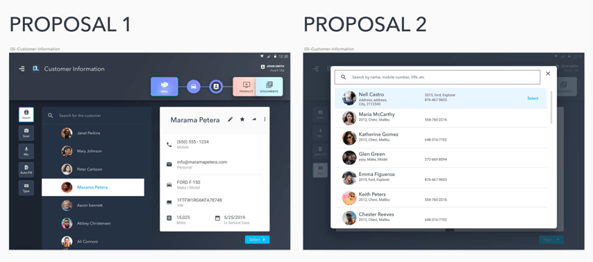
One of the simpler example of the problem that was pointed out was: searching for a customers.
In the designs from phase 1, the scenario was that the service writer would first choose an already existing customer (from the contacts which are accessible from the menu) and then enter the information flow.
But as testing revealed, the customer search needed to be handy, hence was introduced as a part of the customer information screen.
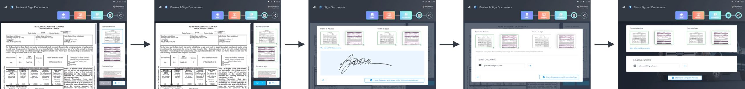
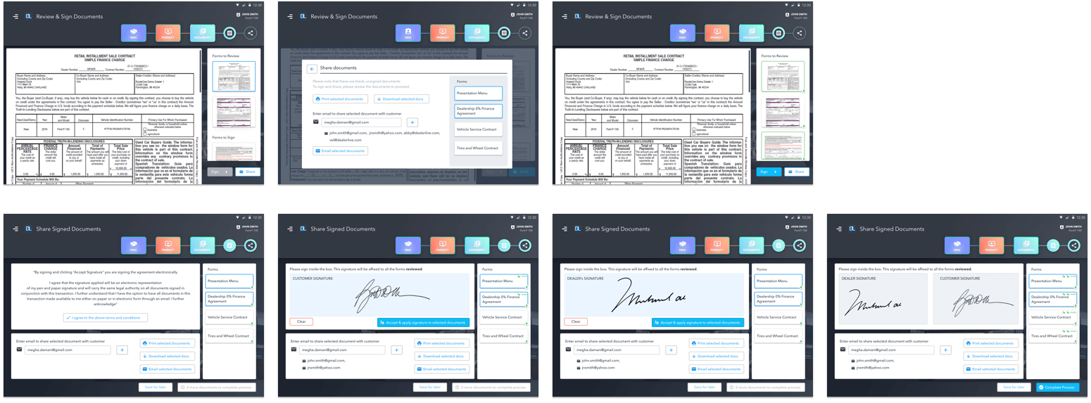
One of the crucial sections that needed good amount of time to re-think & re-design was the documentation section.
Documents Section
In my initial designs, during Phase 1, the document section was rather simple.
You could share unsigned documents and once all the documents were reviewed, the customer could proceed to sign, which would apply to all the documents at once. This leads to the final stage of purchase, sharing those signed documents via email.
Before
Document Section's flow from phase 1
After testing the above flow, it was realised that the signature and sharing process would have to be more elaborate to fit other scenarios like “save for later” and including signatures of both the dealer/service writer & customer as required for legal reasons.
With these additional functionalities, I decided that the steps needed to be divided and made easier for both the stakeholders to understand and process easily & rather quickly.
I combined the sharing feature with the signature sections to make the layout easy to understand as well as have access to share the documents at any stage. Other features like Print and Download were also introduced.
After
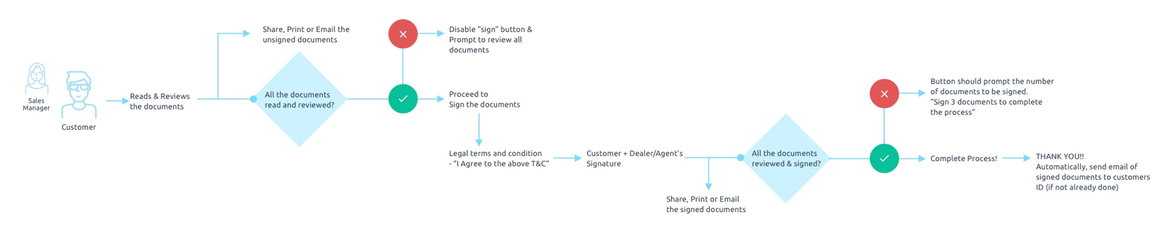
Detailed flowchart of the new documents section
New screens designs for the documents section
Next PHASE
PHASE 3: Designing the cloud platform for dealers to add, modify and make constant updates to the services provided. Managing videos, documents and related materials to the knowledge base.
And other AI features that can help customise & personalise services based on financials, localisation and habits of their customers.