
BOARD OF MANAGEMENT DASHBOARDS
Subsidiary Steering: from comparison to conviction
Squalify
· 2024 to 2025
Senior Product Designer
IC systems work, Multi-stakeholder design, Executive cognition
How a comparison dashboard became a decision-making framework for group-level executives. ⚖️
CHALLENGE
One of Europe's largest financial services groups signed 7 subsidiaries. 40 more were on the way. 🚨
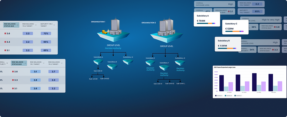
The brief was simple in framing, hard in practice: make group-level decisions across entities with different risk profiles, maturity levels, and exposure footprints.
The first version answered it literally. A comparison table, a Risk Balance trend chart, a 200-year expected loss view. It was the MVP that signed the deal, and the start of what became a flagship feature.
The dashboard was called Subsidiary Steering from day one. For months, it behaved like Subsidiary Comparison. The steering part was what executives did after the meeting. That mismatch was the thing to solve.
Context on the full 8-dashboard system lives on the BOM Landing. This deep dive is about the Subsidiary Steering piece specifically.
WHAT I ACHIEVED
One MVP became a blueprint the platform planned to extend, and a feedback loop that reshaped Squalify. ⚖️
This page was another product design learning for the team. I introduced simple features to reduce cognitive overload so customers could easily scan and make decisions based on their best or worst subsidiaries, with the Top 5 / Bottom 5 choice validated by research across 4 enterprise customers.
I ensured that both target-setting models (different targets, same target) coexisted in one view, and refused to pick sides between 2 credible senior stakeholders while I gathered customer evidence.
I created a blueprint for target-setting across subsidiaries, later planned to extend across the platform wherever quantification projects would impact or be impacted.
Running live in sales and delivery deep dives on a new problem for most customers, the dashboard triggered a wave of feedback and cross-team insights I consolidated across the year that followed.

WHAT I LEARNED
Two lessons that reshaped how I approach ambiguous stakeholder disagreement. 📚
1. The dashboard was called Subsidiary Steering. For months it behaved like Subsidiary Comparison. So I asked 4 questions to shift the work from analytics to deciding. 🎯
Before designing anything new, I asked 5 questions

Those questions shifted the work from analytics to decision-making. Everything downstream came from that pivot.
2. Our founding customer's feedback shaped v1, but with only a handful of customers, every insight had to stay a hypothesis until deep dives validated it. 🔍
Through the year that followed, I ran the dashboard as a live sales-and-delivery prototype across new deep dives. Early on, 2 of 3 multi-entity customers had different org structures, so the design had to hold across variations we hadn't planned for. Most patterns did. Some held in ways I hadn't designed for. One example lives in Design Decision 2 below: the two target-setting modes I designed for internal disagreement became a tool customers used for their own boardroom debates.

Another example: the trend chart. It originally used a quarterly cadence, a Squalify-business assumption. But enterprises plan annually and nobody re-quantifies quarterly. Moving to a half-yearly cadence matched customer reality and a change in Squalify's own annual model refresh.
As one customer put it: "It requires multiple teams to communicate with each other, which takes time and effort. So we plan once at the beginning of the year to foresee some strategies, then again mid-year or Q3 to see how far we are against our earlier set strategies, and if we need to pivot in any major areas."

DESIGN DECISIONS
Two decisions that turned a scaling problem into a decision framework. 🎨
1. Boards focus on the worst performers to avoid losses and glance at the best to reallocate budget. So the page filters to Top 5 / Bottom 5, applied at page level. 🔝
Cognitive load is the enemy here. A multinational with 50 or 500 subsidiaries can't make group-level decisions by scanning a 50-row table.
Applying the filter at page level shifts the table, trend chart, and loss view together, so the board reads one coherent narrative instead of scanning three disconnected views.

2. Two senior stakeholders held equally credible perspectives, so I designed both modes to coexist and let customer deep dives decide which frame resonated. ⚖️
This is the design decision behind the achievement above. Two senior stakeholders held different, well-earned perspectives on how subsidiaries should hit group-level targets:
CSO (from insurance, informed by our closest customer). Each subsidiary has its own target, set so the average across subsidiaries lands on the group's overall target. Different targets, same destination.
SME (former CISO, prior corporate experience). All subsidiaries inherit the group's target as their own, working toward it on independent budgets. Same target, different paths.
Both frames were credible within the experience they came from. Rather than pick between them, I designed both modes to coexist inside the same product surface and let customer deep dives decide.
Over 4 to 5 months, the pattern surfaced: CISOs used both modes to reason with their own C-level peers, depending on their group's structure.
What could have looked like a compromise became a deliberate feature.
The design that held two internal perspectives became a tool customers used for their own boardroom conversations.

OUTCOMES
1 of 2 platform capabilities named in Squalify's US launch. And Regional CISOs picked up the dashboard for a use case I never designed for. 📈
US launch headline capability. Named as 1 of 2 platform capabilities in Squalify's July 2025 US market entry announcement (also on PRNewswire).
Highly downloaded whitepaper and high-traction LinkedIn campaigns on this topic ("How to manage cyber risk across 5, 50, or 500+ entities"). Written by the consulting team, published by marketing.
Published case study. GI Group Scenario, August 2025, quoting risk reductions in the hundreds of millions. Written by the consulting team.
Cross-customer pattern validation. Top 5 / Bottom 5 frame emerged from 4 anonymised customers across financial services and infrastructure.
Multi-stakeholder usage emerged unprompted. Regional CISOs adopted the dashboard for their own region's entities, then shared views upward to the Group CISO. Same dashboard, no modification. The strongest single piece of evidence that the design worked as a framework.
REFLECTION
Collaboration is what turns ambiguous concepts into real dashboards. 🪞
Every dashboard concept started as a hypothesis. We built a storytelling layer that helped the target audience answer specific questions, then slowly moved toward how we could help them decide. This one, specifically, called out the collaboration between two seniors whose on-field experience spoke to different use cases, and design acting as the bridge to make sure the product still worked across the customers we had and the prospects we were talking to.
Turning that into a platform system where customers could choose their own path and compare it with another was the biggest "aha!" moment for the team.
If I had to do it differently, I'd experiment more with this dashboard. Given the timeline, we had to keep everything feasible to implement, which meant limited experiments and no fancy layouts or interactions. The upside: less anxiety on the PM and engineering side, since we could talk implementation next steps without having to scale anything down.