
BOARD OF MANAGEMENT DASHBOARDS
Executive Report: designing for board-level conviction
Squalify
· 2023 to present
Senior Product Designer
Executive cognition, CRQ platform
Designing the dashboard that shifted Squalify from selling a model to selling strategic clarity. 🎯

CHALLENGE
The Executive Report had to survive a boardroom without a consultant standing next to it. 🎯
Executives at large enterprises could already see Squalify's numbers. Walking into a boardroom and using them to defend a direction was another problem entirely.
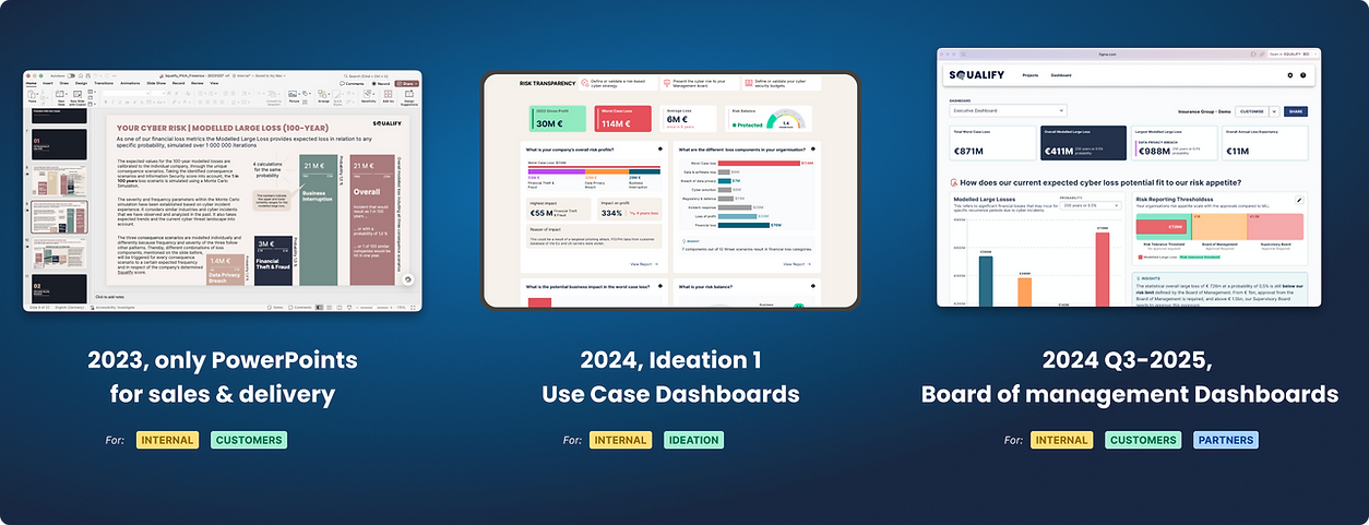
The first design brief was "move the PowerPoint into the product", but reshaping it through the product process surfaced the real issue: changing the format is UI work, and building a decision layer means changing what executives can do with the data. Without that shift, executives would screenshot the dashboards and go back to their decks.
So the real job became cognitive and behavioural change: a dashboard an executive could walk into a boardroom with and use to defend a direction alone.
Context on the full 8-dashboard system lives on the BOM Landing. This deep dive is about the reference dashboard.
WHAT I ACHIEVED
One dashboard, launched in 2024, that kicked off the domino for the rest of the BOM suite in 2025. 🚀
Designed the reference dashboard for the Board of Management (BOM) suite. Every subsequent dashboard inherited its shell.
Ran workshops with the CSO, CEO, and SMEs that landed buy-in on a product-first framing.
Launched the Executive Report in 2024. Positive validation from prospects, customers, and partners kicked off the 2025 domino that shipped the rest of the BOM suite.
Enabled prototype-native selling. Sales moved live from platform to prototype within the same pitch.
WHAT I LEARNED
Five learnings from designing in a new market alongside a domain-expert co-founder. 📚
In a new market, dashboards need to teach the questions before they answer them. Cyber risk quantification is still new. Most customers hadn't done it before, some came from bottom-up methods like FAIR, and nobody was expert yet.
Translated Delivery's PowerPoint practice into a product structure. Their decks answered a specific question per slide, wrapped in an explanation of the numbers. I built Question → Data → Description → Insight so the product could carry that rhythm on its own. It grew into Squalify's design language across every BOM dashboard.
Rephrasing questions in product terms shifts a domain expert's mindset. As the CSO shared his vision, I'd drill down with framing questions ("is this different for partners? is there Squalify terminology we need to explain?") while wireframing live in Figma. Each rephrased question taught product thinking; the wireframe locked the framing.
In a startup, big dreams ship in sustainable steps. When the CSO asked questions about a fancier chart, or the CEO asked "what else?", I'd counter-propose something buildable that still landed the intent. That's how comparison charts came in.
Compression is the proof of shared vocabulary. By the 8th dashboard, our rhythm ran on 2 brainstorms + 1 polishing session, down from 6. Domain-mind and product-mind converged into one team.
DESIGN DECISIONS
Three decisions that let one dashboard work for every board conversation. 🎨
1. Every section built around a specific board question, structured Question → Data → Description → Insight. That structure became Squalify's design language. 🧭
Cyber risk quantification is still a new market. Charts by themselves land differently for a CISO who reads them daily and a CFO seeing WCL for the first time.
Each section on the Executive Report had to answer the specific question a board would ask: "how does our current expected cyber loss fit our risk appetite?" / "how does the WCL impact our balance sheet?" / "where do we compare against peers?"
The Question → Data → Description → Insight structure made every section self-contained. The board could jump in at any point and still find their footing. Interaction patterns (hover, focus, filtering) replaced slide-style arrows, and the same dashboard worked across customers with zero per-prospect customisation.
Every subsequent BOM dashboard inherited it. That structure became Squalify's design language, and it's why Delivery could sell the platform without a slide deck.

2. Layouts + widgets built as a composable library, so each tenant could steer its own dashboard flow. 🧩
The original plan was to design many dashboards in parallel across the BOM suite, which would have produced 8 near-identical products with 8 different sets of debt. So I built the system as a composable library:
6 stackable layouts per section, chosen based on how many widgets a section needed.
A section = Question + Layout. Any widget could drop into a layout: charts, insights, or "What is this?" panels.
Default dashboard flows shipped per tenant. Each customer had their own tenant, an isolated environment for their users, projects, and data.
Per-tenant customisation was easy. Section changes → layout changes → widget swaps. When one customer needed the MLL chart where another had WCL, that was a one-tenant swap.
By the 8th dashboard, we were composing from this library. The CSO rhythm compressed from 6 sessions to 2 brainstorms + 1 cleaning session, and any new use case or market avenue fit inside it.

3. With C-level users contractually inaccessible, sales demos and POV sessions became the research. 🔍
Our users were C-level executives at large enterprises: contractually inaccessible, time-constrained, usually reached through partner intermediaries. Traditional user research wasn't going to happen. So I built the discovery layer from what we already had:
Sales demos became user research.
Proof-of-value sessions became usability tests.
Webinar drop-off, feedback, and audience questions told us what landed.
The consulting team's observations turned into product hypotheses.
Any single customer's request rarely made a design brief on its own. When the same pattern showed up across 3+ customers in different industries, that's when I moved on it.

OUTCOMES
The Executive Report became one of Squalify's headline US-launch capabilities. 📈
Named as 1 of 2 headline platform capabilities in Squalify's July 2025 US market entry press release (also on PRNewswire), publicly marketed as the Board of Management Report.
Public customer testimonial from Jungheinrich on Squalify's own Board of Management Report page. Dr Tim Sattler on tracking the impact of cybersecurity investment and defending funding decisions.
The reference for the whole suite. The Executive Report acted as the reference for my subsequent BOM designs and gave engineering the basis for the platform's technical architecture during implementation.
Customer cognitive transfer. In a December 2024 session with a global CPG prospect, an executive began interpreting the graphs back to our consulting lead. The design worked as intended.
Prospect momentum shift. Recurring signal across 7 European enterprise prospects: prospects moved from is this useful? to "how do we begin?" after seeing the Executive Report in demo.
REFLECTION
The design taught the company what it was selling. 🪞
The hardest part was teaching a SaaS product mindset without saying it out loud. The design did the showing.
The CSO is a former Munich Re consultant with 20 years of customer conversations behind him. His confidence in his own model was earned. My job was to extract what he knew, translate it into a product artifact, and give him back a first look at what building a platform actually meant. The prototype had to shift his model while respecting his experience, just enough to make him want to argue for it.
Then the showcase travelled. The same demo pitched to the CEO, the sales team, and the delivery and consulting SMEs became a sales play in its own right. Each SME came back with their own use-cases and problem spaces, which turned into the other BOM dashboards (see the BOM Landing). Startup work at its most honest: the design taught the company what it was selling.
The other lesson lives in what I didn't do. Per-prospect customisation became a paid Proof-of-Value deliverable produced during sales' deep-dive sessions. Editing controls stayed out of the early Figma versions on purpose, giving engineering space to kickstart the platform's technical implementation faster instead of inviting "when can we have this?" pressure. And the dashboard walked the board through one problem at a time; anything that didn't belong in that storytelling walkthrough didn't ship.